For this week’s edition of the Equity Leaders Weekly, we are going to take an in depth look at the Energy sector. After highlighting Crude Oil’s weakness two weeks ago, we wanted to focus on the Energy sector again today amid concerns in the Middle East as a Saudi-led alliance on Monday broke off ties with Qatar, who is the world’s largest LNG exporter, amid terrorism backing allegations. We will analyze the Canadian Energy Sector and look at a way to utilize the power of SIACharts’ Relative Strength to look at how you can outperform the sector index if you still want exposure to this area.
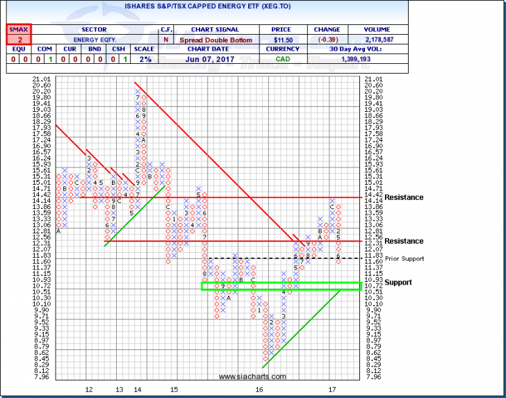
iShares S&P/TSX Capped Energy (XEG.TO)
With WTI Crude Oil Futures trading lower yesterday by over 4%, the price of crude dropped to around $46 as the volatility within its trading range has continued. The U.S. Energy Information Administration reported that crude oil inventories rose by 3.3 million barrels last week, which was larger than expectations and continues to put pressure on bloated global inventory levels.
The iShares S&P/TSX Capped Energy ETF (XEG.TO) tracks the Canadian Energy sector. This ETF was ranked in the Favored zone of many SIA reports for most of 2016 as the ETF was a top sector performer and up almost 39% on the year. However, 2017 has been a different story as the ETF moved out of the Favored zone in early March and has been in the Unfavored zone ever since as a sector to stay away from as it is down now around 17.9% after market close on Wednesday.
You can see the column of O’s that XEG.TO has been in since the beginning of the year, having just moved down through prior support at $11.60, support can now be found around $10.51 to $10.72. These levels coming into play if this weakness continues would also coincide with a potential trendline break. Looking at the U.S. Energy Sector equivalent, the Dow Jones U.S. Energy Sector Index is down around 14% so far YTD, and is also showing relative weakness across the board compared to other sector opportunities. So both Energy sectors in Canada and the U.S.
S&P/TSX Capped Energy Index vs. Equal Weight Energy Index
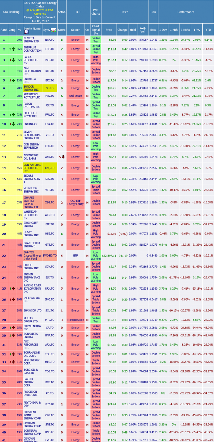
Surprisingly, the S&P/TSX Capped Energy Index is highly concentrated in two stocks, Suncor Energy (SU.TO, 27.14%) and Canadian Natural Resources (CNQ.TO, 19.84%) that make up almost 50% of the cap-weighted Energy Index. By tracking just these two symbols, SU.TO and CNQ.TO, you would most likely know how the index is performing for that day or time period. However, that hasn’t been the case so far this year with Suncor down only -5% so far YTD and CNQ.TO down only -9.4% YTD, compared to the index which is down so far -18%. We highlighted these names in the Relative Strength Matrix to show how they are ranked higher than the XEG.TO
So if it is not these two concentrated positions dragging down the index, where is this underperformance coming from? How do you know which names to stay away from if you want to outperform the S&P/TSX Capped Energy Index?
The answers lie within running a SIA Relative Strength Matrix of the 39 Energy companies in the index. In the matrix screenshot, we have a ranked order of these components where we can see the stronger and weaker energy names within this peer group. There is a big difference between holding the top 10 names in these rankings where the average YTD performance is about -4% versus holding the bottom 10 names where the average YTD performance is about -35%!
Another simple way to analyze this report and determine if you should buy the concentrated names like SU.TO and CNQ.TO over alternatives, is to see where the Capped Weighted ETF (XEG.TO) ranks versus an Equal Weight Index Benchmark (EWIXEG.TO). In this case, XEG.TO is ranked 5 spots higher in the matrix letting us know that the larger cap names are most likely outperforming the smaller cap components within this index. These are highlighted in Red in the matrix screenshot so it is easy to visually find and compare.
Hopefully you can think of some of the great extensions that this Relative Strength ranking example can provide. It can help you determine: 1) If you should invest in the Energy sector right now or avoid it all together by looking at the SIA Sector rankings 2) Should you invest in a cap-weighted or equal-weighted version of the sector 3) Which names to overweight within that sector or style and which higher risk names to underweight or avoid all-together and 4) Pairs trades or other opportunities for long-term value-add to your portfolios.
For a more in-depth analysis on the relative strength of the equity markets, bonds, commodities, currencies, etc. or for more information on SIACharts.com, you can contact our sales and customer support at 1-877-668-1332 or at siateam@siacharts.com.
SIACharts.com specifically represents that it does not give investment advice or advocate the purchase or sale of any security or investment. None of the information contained in this website or document constitutes an offer to sell or the solicitation of an offer to buy any security or other investment or an offer to provide investment services of any kind. Neither SIACharts.com (FundCharts Inc.) nor its third party content providers shall be liable for any errors, inaccuracies or delays in content, or for any actions taken in reliance thereon.
Copyright © SIACharts.com